Health literacy… it’s not just plain English
December 18, 2017 | Patient-centric, Patient-centricity, data visualisation, health literacy, patient engagement, patient focus
In this day and age, you would think that clear communication would be second nature to us all, but this is not so. In our digital world misunderstanding and confusion can easily occur, especially when dealing with medical information.
Healthcare is complicated, full stop. Bursting with complicated language, random abbreviations, medical jargon and complex statistics, it is no wonder many people find health information so difficult to understand. This struggle becomes even more difficult when you are suffering from an illness or being treated for a chronic condition.
This is where health literacy plays a vital role. It ensures that patients understand the information they have been given but most importantly that they can act upon it. Defined as the communication of health information in ways that others can understand and act on, ‘health literacy’ is a crucial step in helping your patients make informed choices about their own health.
However, health literacy is not just about plain English, it is also about putting the right words into context and simple visualisation to ensure your target audience get the most out of the communication materials you produce.
In this article, we want to share with you some great examples that show when done well, how context and simple clear visualisation can really make a difference.
Blood Test Results
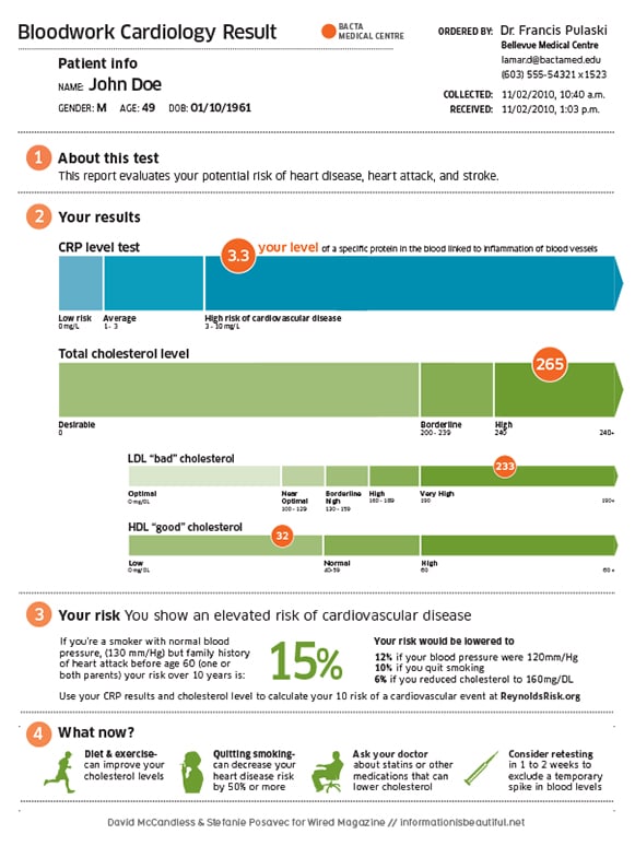
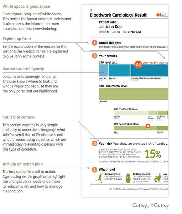
David McCandless, the author of Information is Beautiful and Knowledge is Beautiful, and Stefanie Posavec demonstrate how simple graphics can be used to explain complex medical information. Many of us have been on the receiving end of blood test results, only to be given a sheet of meaningless numbers and figures and told not to worry as everything is fine. But how do you really know everything is fine and there is nothing to worry about?
They took a complex blood test result and transformed it into something that is easy to read, understand and act on; all principles of health literacy.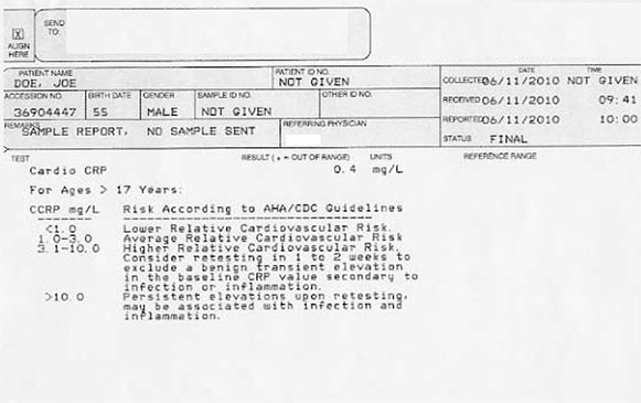
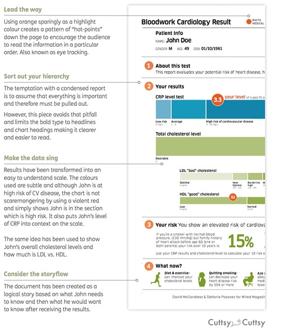
Blood Test Results – a breakdown
Blood Test Results mark 2
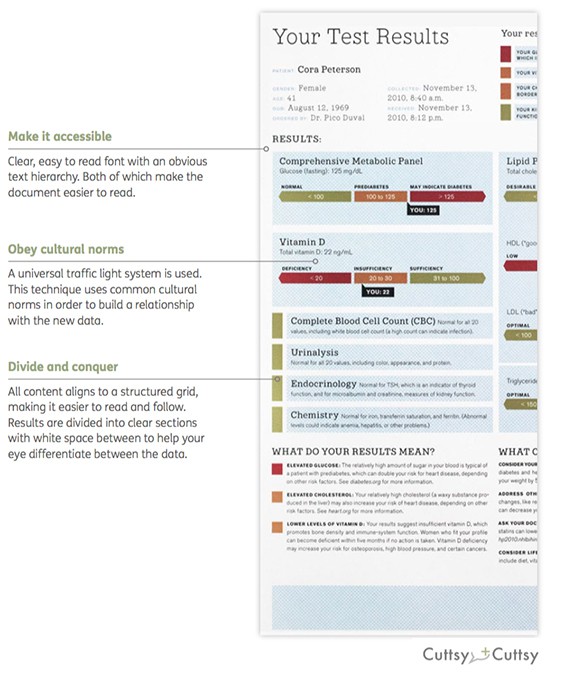
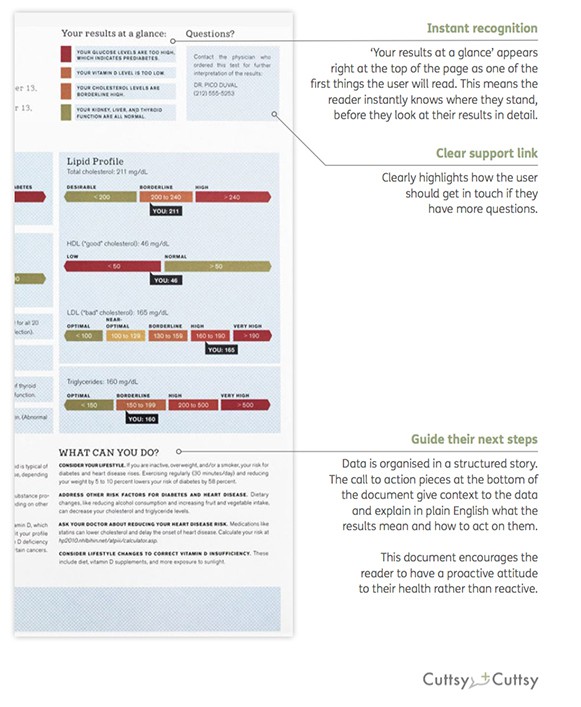
The second example we have chosen by Mucca Design takes another complex set of blood test results and transforms them into an understandable document. Along with clear and concise language, we like the way this example highlights the benefits of simple graphics to explain complex data.

Blood Test Results mark 2 – a breakdown
www.clinicaltrialsexplained.com
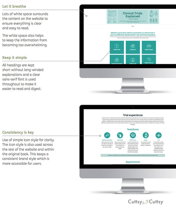
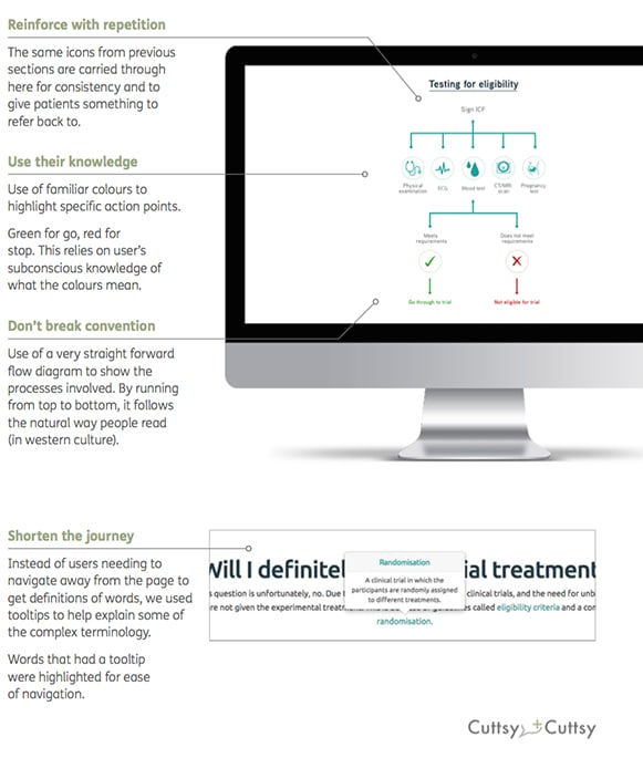
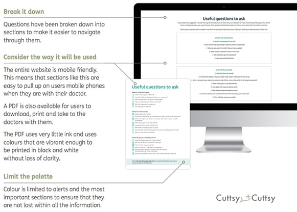
This is an example which we are really proud of. Following the success and endorsement by the Clinical and Contract Research Association (CCRA) of our e-book, we developed a supporting website. The website showcases how health literacy principles can be used successfully across different media to ensure information is understandable for all.
By keeping the website design clean and using splashes of colour for the icons and graphics alongside the use of simple language, we ensured that key points are not lost in a sea of information. 
www.clinicaltrialsexplained.com – a breakdown
Top 5 tips for creating great health literacy pieces
1) Write copy in plain English
2) Always provide context
3) Use clear visualisation and simple graphics
4) Use lots of white space for clarity
5) Include a call to action
A final word
As a healthcare communications agency we have a responsibility to take away the fear of the unknown and ensure patients understand the health information they have been given and when to act.
However, as we have highlighted in this article, understanding health information is not just about using plain English. Visualisation and putting the right words into context are key to maximising accessibility.
By using these principles, we can all help people feel more in control of the choices they make about their own health and actually make a difference to their lives. At the end of the day isn’t that what we all want as patients?
If you would like to find out more email us at letstalk@cuttsyandcuttsy.com
Authors: Dr Liz Walder and Sarah Gracey
Company Details
Latest Content from Cuttsy + Cuttsy
New report now available: Integrating ‘patient first’ into medicine development
A new report has just been published by Cuttsy+Cuttsy that collates all the current best thinking in the ‘patient first’ space, distilling it into a practical and actionable road map...
The digital prescription – enhancing the patient experience with technology
We explore how digital health innovations are revolutionising patient care by enhancing accessibility, personalisation, and engagement, promising a more connected and empowered patient experience.
Compliance — a driving force for influencing public perceptions of the pharma industry?
How does compliance play into public perceptions of pharma and why is it important for improving public opinion?
Another year, another B!
Louise Jones, Cuttsy+Cuttsy's Sustainability Officer reflects on their latest year of carbon reporting through CDP and on achieving another B rating.
Jon Hume Joins Cuttsy+Cuttsy as New Commercial Director
Cuttsy+Cuttsy is excited to announce the appointment of Jon Hume as Commercial Director, effective 1st March 2024.
Clinical trial considerations: Why supporting HCPs matters…
When HCPs have the necessary information, they can more easily communicate it to patients using simplified language and a confident, calm tone.
Clinical trial considerations: Why diversity matters…
Diversity in clinical trials is crucial for understanding diseases and developing new treatments. Here's why diversity matters...
Clinical trial considerations: Why digital matters…
Digital technology in healthcare is rapidly evolving. In this blog we delve into how digital solutions can help improve patient experience within clinical trials.
Clinical trials explained: Why imagery matters…
Recruiting patients for clinical trials is one of pharma's greatest challenges. Imagery is a great way to connect with people on an emotional level and forms a big part the...
Clinical trials explained: Why health literacy matters…
Clinical trial recruitment can be a challenge. By applying the principles of health literacy to all materials, we can support people to make an informed choice about whether to take...


