Health literacy… it’s not just plain English
December 18, 2017 | Patient-centric, Patient-centricity, data visualisation, health literacy, patient engagement, patient focus
In this day and age, you would think that clear communication would be second nature to us all, but this is not so. In our digital world misunderstanding and confusion can easily occur, especially when dealing with medical information.
Healthcare is complicated, full stop. Bursting with complicated language, random abbreviations, medical jargon and complex statistics, it is no wonder many people find health information so difficult to understand. This struggle becomes even more difficult when you are suffering from an illness or being treated for a chronic condition.
This is where health literacy plays a vital role. It ensures that patients understand the information they have been given but most importantly that they can act upon it. Defined as the communication of health information in ways that others can understand and act on, ‘health literacy’ is a crucial step in helping your patients make informed choices about their own health.
However, health literacy is not just about plain English, it is also about putting the right words into context and simple visualisation to ensure your target audience get the most out of the communication materials you produce.
In this article, we want to share with you some great examples that show when done well, how context and simple clear visualisation can really make a difference.
Blood Test Results
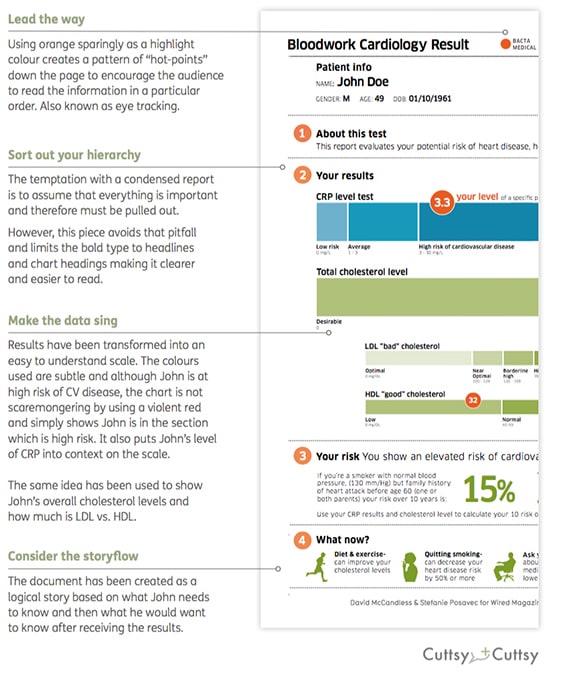
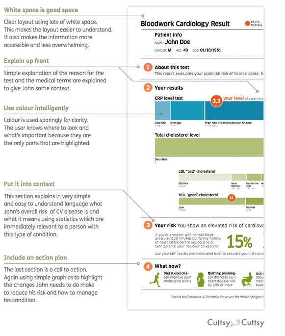
David McCandless, the author of Information is Beautiful and Knowledge is Beautiful, and Stefanie Posavec demonstrate how simple graphics can be used to explain complex medical information. Many of us have been on the receiving end of blood test results, only to be given a sheet of meaningless numbers and figures and told not to worry as everything is fine. But how do you really know everything is fine and there is nothing to worry about?
They took a complex blood test result and transformed it into something that is easy to read, understand and act on; all principles of health literacy.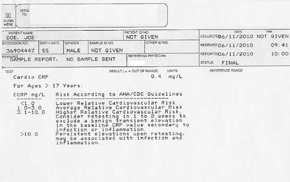
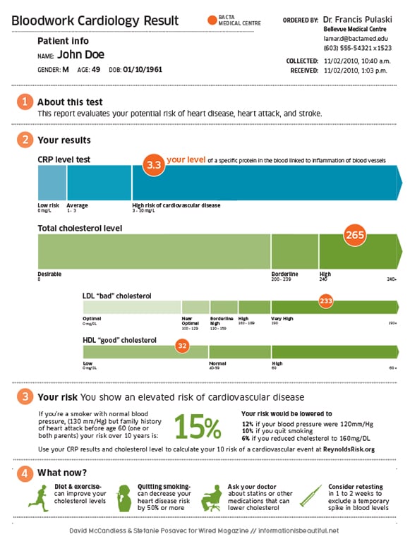
Blood Test Results – a breakdown
Blood Test Results mark 2
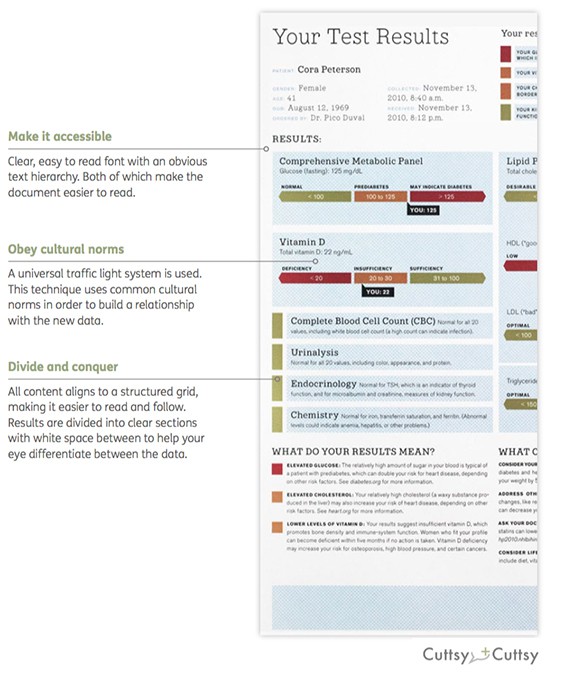
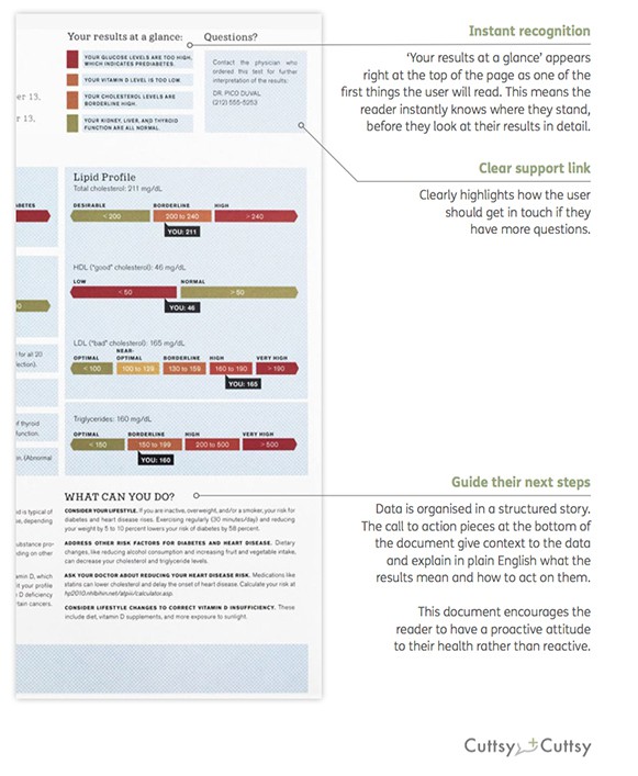
The second example we have chosen by Mucca Design takes another complex set of blood test results and transforms them into an understandable document. Along with clear and concise language, we like the way this example highlights the benefits of simple graphics to explain complex data.

Blood Test Results mark 2 – a breakdown
www.clinicaltrialsexplained.com
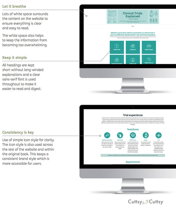
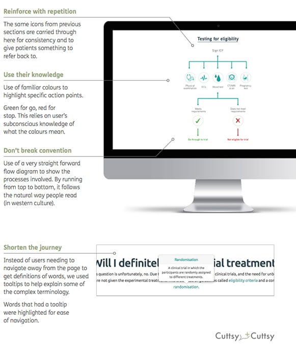
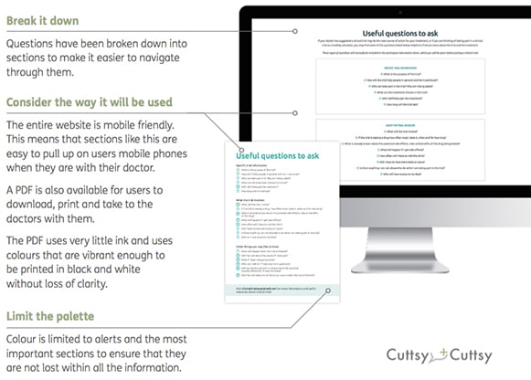
This is an example which we are really proud of. Following the success and endorsement by the Clinical and Contract Research Association (CCRA) of our e-book, we developed a supporting website. The website showcases how health literacy principles can be used successfully across different media to ensure information is understandable for all.
By keeping the website design clean and using splashes of colour for the icons and graphics alongside the use of simple language, we ensured that key points are not lost in a sea of information. 
www.clinicaltrialsexplained.com – a breakdown
Top 5 tips for creating great health literacy pieces
1) Write copy in plain English
2) Always provide context
3) Use clear visualisation and simple graphics
4) Use lots of white space for clarity
5) Include a call to action
A final word
As a healthcare communications agency we have a responsibility to take away the fear of the unknown and ensure patients understand the health information they have been given and when to act.
However, as we have highlighted in this article, understanding health information is not just about using plain English. Visualisation and putting the right words into context are key to maximising accessibility.
By using these principles, we can all help people feel more in control of the choices they make about their own health and actually make a difference to their lives. At the end of the day isn’t that what we all want as patients?
If you would like to find out more email us at letstalk@cuttsyandcuttsy.com
Authors: Dr Liz Walder and Sarah Gracey
Company Details
Latest Content from Cuttsy + Cuttsy
Cuttsy+Cuttsy awarded CPD Platinum by the IPA
Four years after being awarded Gold for their continuous professional development (CPD) Cuttsy+Cuttsy (C+C) have reached another milestone and been awarded Platinum accreditation.
Clinical Trials Materials: Getting the Basics Right
For those unfamiliar with them, clinical trials can be rather bewildering. This presents problems when it comes to recruiting patients — how can we make sure they understand what they...
Cuttsy+Cuttsy named one of the Best Places to Work 2019 by Campaign
11 March 2019—Cuttsy+Cuttsy are honoured and extremely proud to be named one of the 50 Best Places to Work in 2019 by Campaign. The results were announced on 6th March...
Rare Disease Day 2019
Today is #RareDiseaseDay and is an opportunity to highlight some truly unbelievable/frightening statistics around rare diseases.
Health Literacy in Practice: Doctor’s Letter
If a patient was given their results directly, how could we make it into something they could understand and, most importantly, act on?
International Childhood Cancer Day 2019
The number of new cases per year is shocking but the journey and the outlooks have vastly improved. We've pulled together an infographic to show just what we mean with...
Can wearables really transform healthcare?
The impact of wearables on our health or simply a fad? Author: Russell Ings
Season’s Greetings
Do you have Tinsilitus?
Cuttsy+Cuttsy launch their latest patient e-book
On the eve of ‘World Osteoporosis Day’ (worldosteoporosisday.org), Cuttsy+Cuttsy are proud to launch their latest e-book ‘Osteoporosis…in plain English’.
Insights from the charity sector – from patient engagement to people-driven design
Marianne Guldbrandsen, Strategy Director at Cuttsy+Cuttsy and former Head of Innovation and Strategic Partnerships at Macmillan, discusses how people-driven research leads to truly patient-centred products and services, and what the...


