The 10-year Web Challenge
February 18, 2019 | Functionality, UI, UX, User interface, user experience, web design
Understanding your users’ needs is more critical online today than ever. A site should mould itself around these insights, deliver those needs quickly, efficiently and with plenty of white space.
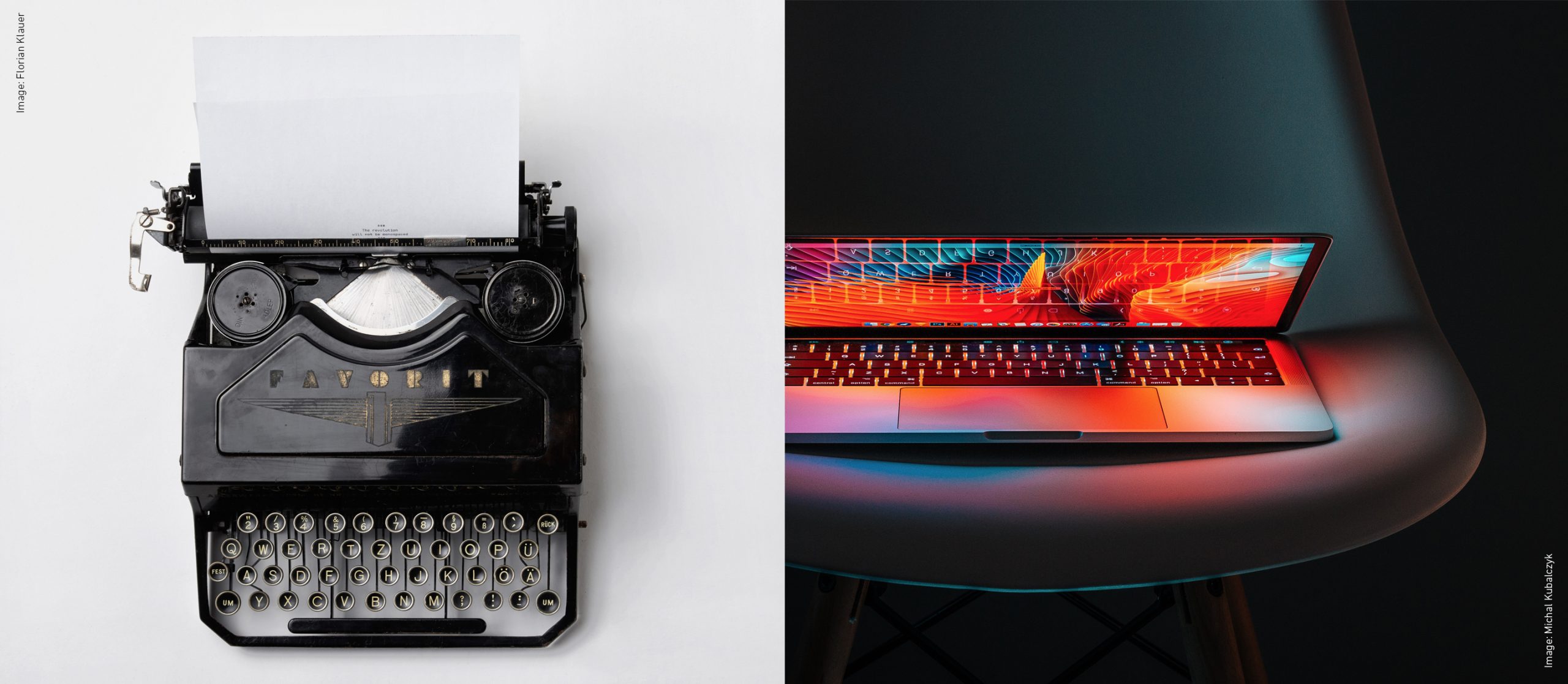
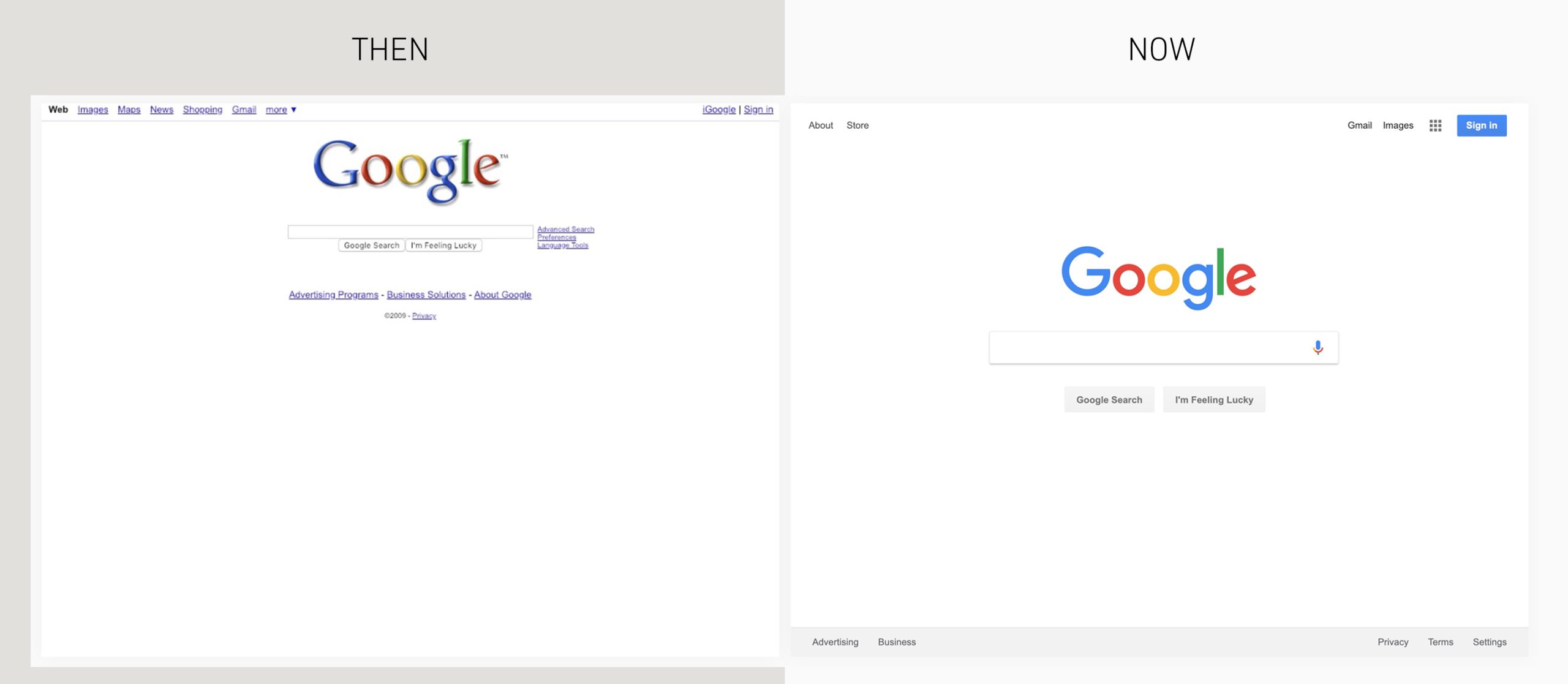
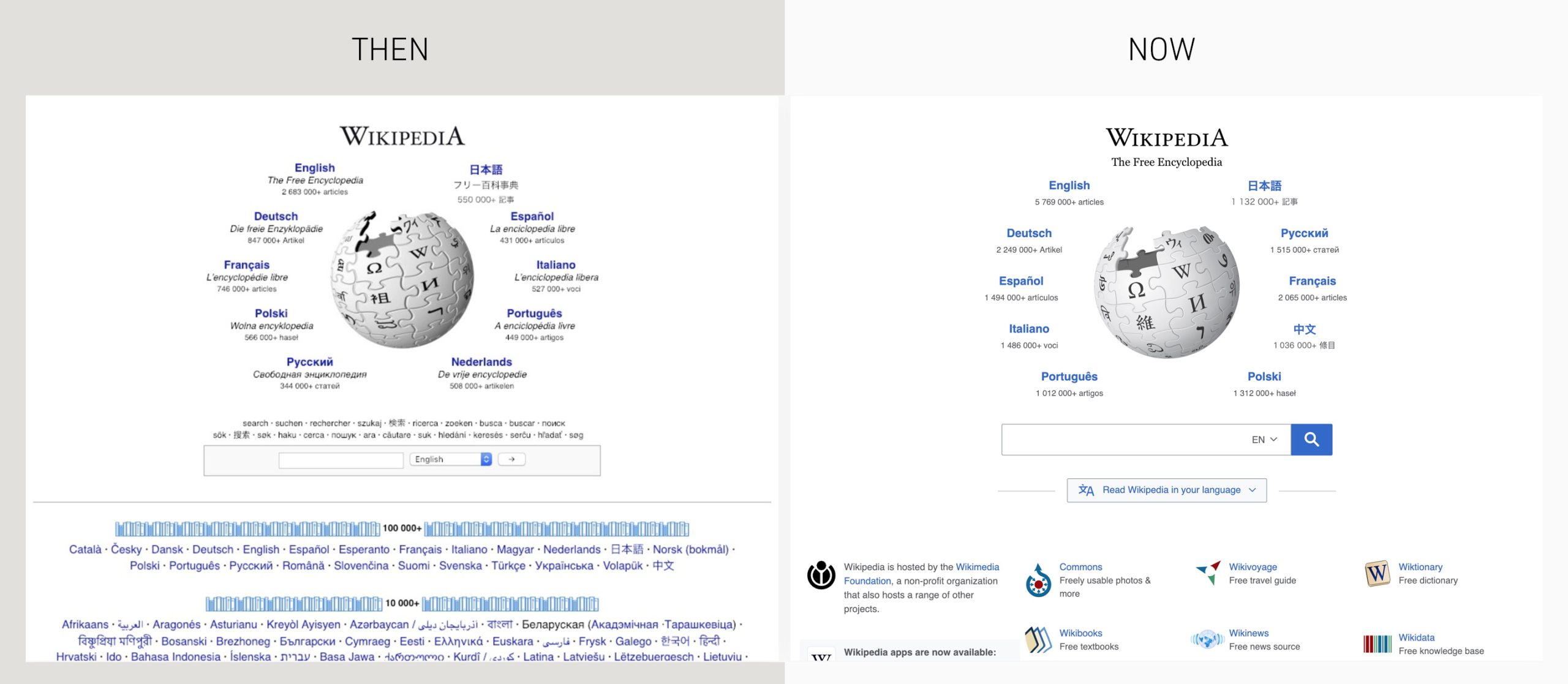
The 10-year challenge, a task in which one posts comparative photo’s (now vs 10-years ago) has taken the online world by storm with the concept flooding social media. The challenge originally featured self-portraits (selfies I believe they’re called these days), but was then utilised for common causes such as global warming (the size of the polar ice cap) and plastic in the ocean. Here is one application of the concept I found interesting and nostalgic in equal measure: The 10-year challenge for the big websites, which highlights the evolution of web design (and therefore user experience and user interface). It illustrates how sites and companies can change based on the needs of the user.
It would seem, as I’m sure my fellow designers suspected, less is indeed more. Space is undoubtedly (as we knew) good for readability. It can be a fierce battle between designer and client when it comes to how much content is included in a piece of communication, even more so when it comes to creating a web page. One assumption (often that of the client) is that there is unlimited space, so more can be included. The reality is the opposite: the net is infinite, there are countless websites available, countless sites that are similar to the one you are currently creating – and users have a fairly low attention span. You must fulfil their needs, and quickly. Overpopulate your site, and you’ll lose them. Yahoo has to be one of the worst sites I’ve seen (from a designers perspective) when it comes to overpopulation. Even now, it’s barely better than it was 10 years ago (in my humble opinion).

Also, and potentially more importantly, of note are those sites (such as Google, Wikipedia, Craigslist and Facebook login) that haven’t changed their core functionality. Their users’ needs have remained the same, and the sites have remained single-minded. Not adding for the sake of adding and not complicating the experience for no reason. They have only undergone slight modernisation of fonts and style (alongside the aforementioned ‘more space’ update). Proving further that, as well as ‘less is more’, ‘form’ indeed ‘follows function’.
Overall, all these examples demonstrate the importance of understanding the users’ needs: What are they visiting sites to do? What content are they engaging with? What do they do once they’ve visited a site and what’s their onward journey? This should be the primary driver when it comes to design, layout and functionality. This understanding of the audience should result in a site that moulds to meet their needs.
Examples in point:
Microsoft – from technical Software needs to tools for lifestyle
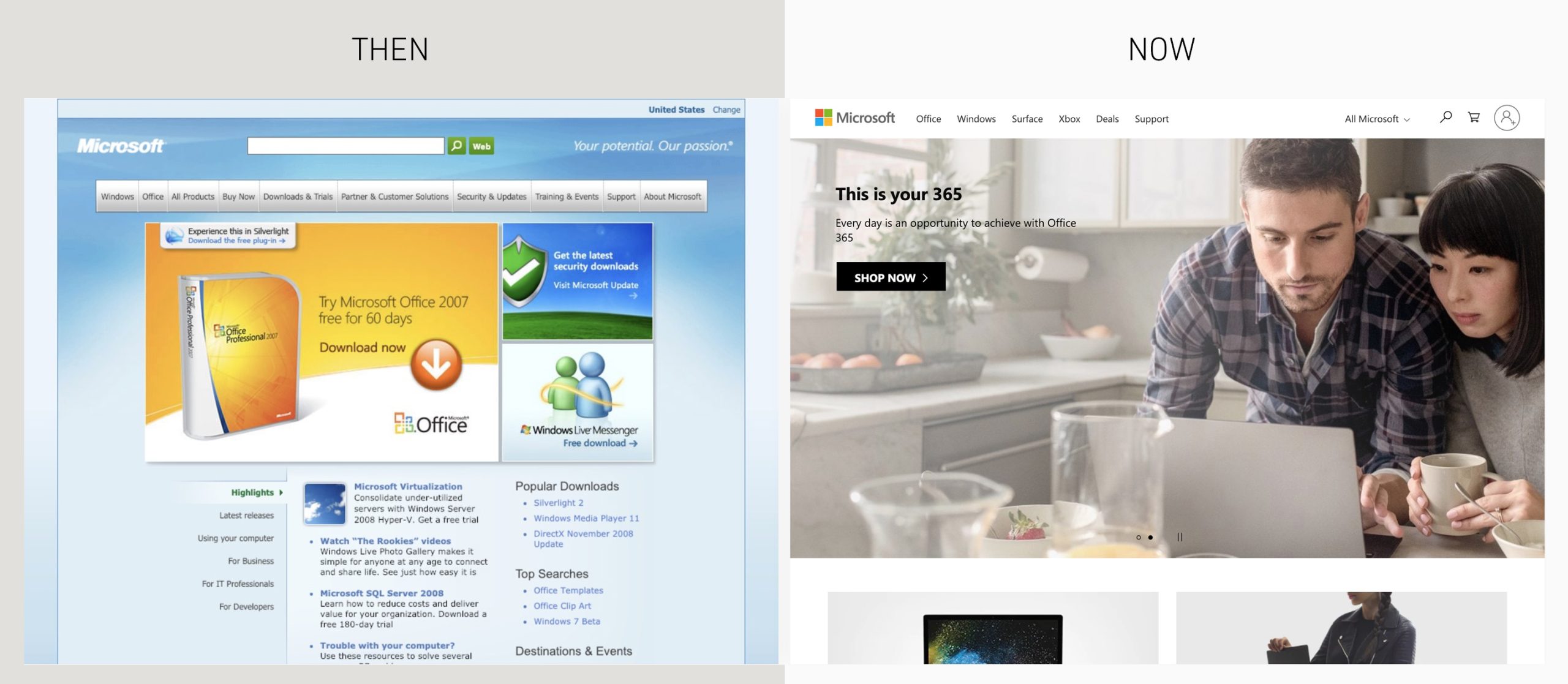
https://www.microsoft.com/en-gb/
Apple – from Software and Apps to Hardware

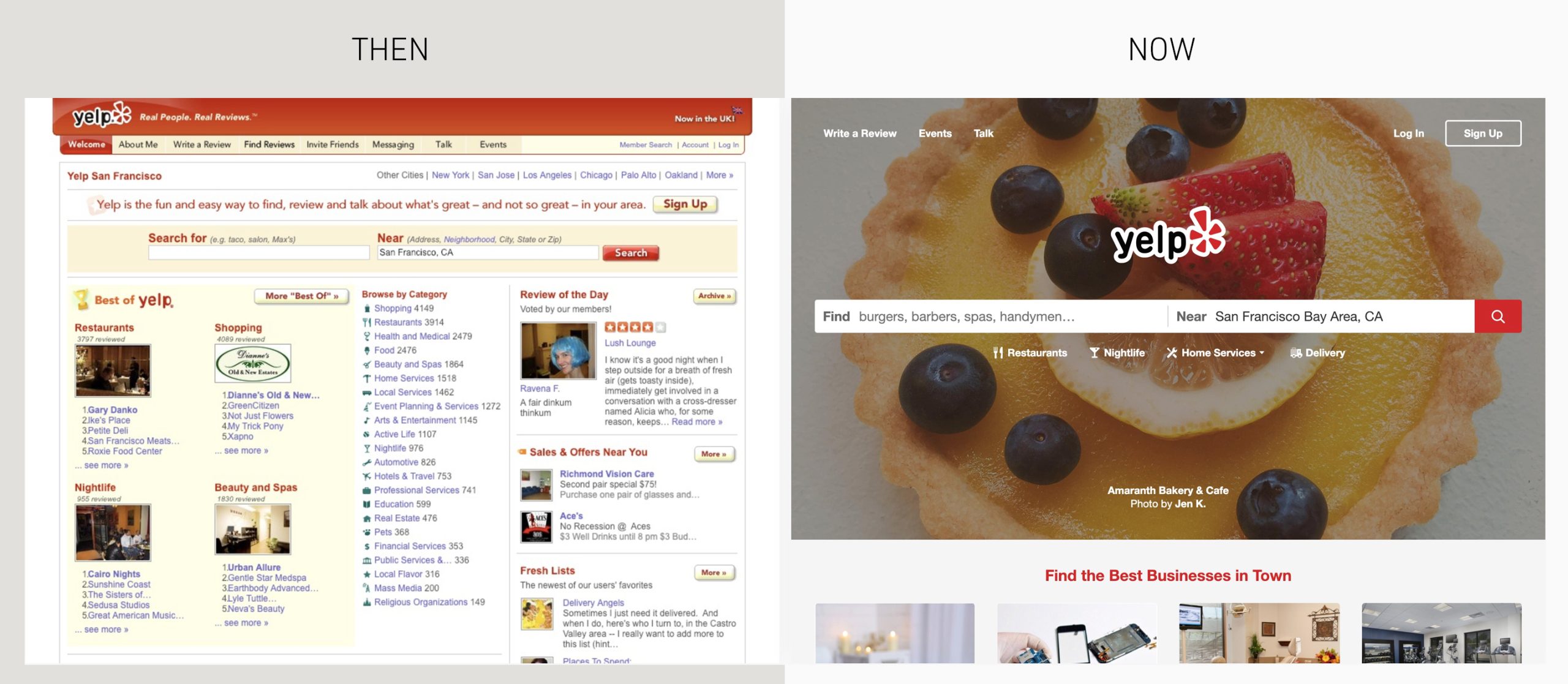
Yelp – from reviews to finding a restaurant
The ‘takeaway’ from this for me (so to speak), is that knowing your audience, knowing what they need and why they engage with your brand
is more critical today than ever. In such a crowded space as the good old fashioned electronic interweb, presence must be clear and your site must perform the job the user needs it to. It must do it quickly, efficiently and with plenty of white space.
See more comparisons here:
https://www.arun.is/blog/10-year-challenge/
Author: Paul Hunt
This content was provided by Page & Page Health
Company Details
Latest Content from Page & Page Health
Not another weight-loss ad
Christmas is over and the gyms are packed, it’s a never-ending tale. But why do we do it to ourselves every year?
Page & Page has been shortlisted for an award!
Page & Page are excited to be shortlisted for a PM Society Award
Givers and Takers
Have we lost the ability to identify the difference between net givers and net takers of energy?
Focus on doing one thing well
Does pharma have something to learn from Welsh jeans maker Hiut Denim when it comes to focus?
Marketing to healthcare professionals – what’s the key ingredient missing from most campaigns?
What do you think is the difference between a campaign developed to win a share-of-mind with consumers and a campaign designed to gain the attention of healthcare professionals?
Video – The importance of efficient ideas
With the right idea, video is a powerful tool within any industry, with the wrong idea it can become a time-consuming money sponge. An efficient idea is a must.
Is healthcare behaving badly with plastic?
It’s time for the healthcare sector to demonstrate leadership in plastic recycling and the use of sustainable plastics.
Page & Page: PMEA finalists 2018
Page & Page have been shortlisted for the "Excellence in Marketing Established Products" award for their work in the nutrition industry.
Can we talk about the ego-bias and chemicals influencing your target audience’s behaviour?
Over the Summer, the Page & Page team became fascinated by two books on this very subject. Two books from one author, Dean Burnett, an eminent neuroscientist, lecturing at Cardiff...
The power of video
Video is not a new marketing channel. Compared to the realms of augmented and virtual reality it’s been around for donkey’s years. And yet video has continued to grow in...

