Content for all – how to connect with neurodiverse audiences
March 31, 2025 | Inclusion, Neurodivergent, content, design, healthcare comms
Discover essential strategies for crafting inclusive and accessible written content tailored for neurodivergent readers.

Most written content is generally designed and presented for a neurotypical audience. This means that for the 1 in 5 people who are neurodivergent,1 engaging with written content can be a daily challenge.
Accessible and inclusive content is vital in creating equity and embracing diversity. The good news is that there are many ways to support neurodivergent individuals to process information being communicated. In this blog, we will explore three ways to support the development of accessible content for neurodivergent readers.
Key strategies for inclusive content
- Prioritise the style and appearance of written information
The readability of content begins with choosing the right font and layout.Sans serif fonts like Arial, Verdana, and Calibri are most inclusive for a neurodiverse audience. This is because they make letters look less crowded, which can facilitate understanding and speed of reading.
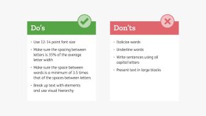
There are other ways to improve the style and appearance of writing too:2,3
- Use colours that consider sensory processing differences
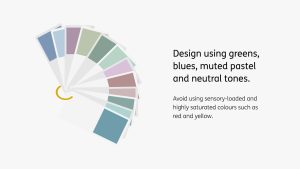
Colour plays a crucial role in how content is perceived and processed by neurodivergent audiences. It is important to avoid sensory-loaded and highly saturated colours such as red and yellow in designs since they may trigger sensory overload in some readers. Greens, blues, muted pastel and neutral tones are better to choose from because they are less stimulating and evoke feelings of peace and tranquillity.4,5
High contrast colours such as white and pure black on printed materials can be dazzling and visually stressful for neurodivergent readers. Instead, a light background with dark grey text can help with readability. The same is true for digital materials, whilst giving the option to switch the interface between light and dark mode or to a specific hue saturation can help enormously.6
- Use visuals and graphics to communicate information
Concise writing that avoids metaphors and figurative language as well as visual aids can significantly enhance attention, comprehension and retention for neurodivergent readers.7,8
Visual elements act as cues and bring structure and sequence to writing. Icons and images placed throughout documents can also help to anchor words to the page and help readers navigate through a written resource more efficiently. Icons and images may also help form memories and improve understanding.2
While traditional content often caters to neurotypical audiences, making small adjustments in font choice, colour use, and visual aids can create a more inclusive experience for neurodivergent readers. For more detailed guidelines on creating accessible content, explore resources from the Neurodiversity Design System, Inclusion & Accessibility Labs, and the British Dyslexia Association.
At Cuttsy+Cuttsy, we are committed to making healthcare communications accessible for everyone. Please get in touch if you’d like to find out more about the work we do.
References
1. The Brain Charity (2022). Accessed: September 2024.
2. British Dyslexia Association (2023). Accessed: September 2024.
3. Dyslexia Support South (2023). Accessed: September 2024.
4. Full Fabric (2024). Accessed: September 2024.
5. Experia (2021). Accessed: September 2024.
6. Neurodiversity Design System (2024). Accessed: September 2024.
7. Fighting Talk Communications (2024). Accessed: September 2024.
8. Bedrock Learning (2022). Accessed: September 2024.
This content was provided by Cuttsy + Cuttsy
Company Details
Latest Content from Cuttsy + Cuttsy
Clinical trial considerations: Why digital matters…
Digital technology in healthcare is rapidly evolving. In this blog we delve into how digital solutions can help improve patient experience within clinical trials.
Clinical trials explained: Why imagery matters…
Recruiting patients for clinical trials is one of pharma's greatest challenges. Imagery is a great way to connect with people on an emotional level and forms a big part the...
Clinical trials explained: Why health literacy matters…
Clinical trial recruitment can be a challenge. By applying the principles of health literacy to all materials, we can support people to make an informed choice about whether to take...
Clinical trials explained: Why iconography matters…
Icons serve as a useful form of alternative communication. We spend a lot of time developing icons for healthcare communications. Find out how we use iconography to elevate clinical trial...
Cuttsy+Cuttsy appoints Harriet Karia as Managing Director
Cuttsy+Cuttsy is pleased to announce the appointment of Harriet Karia as its first Managing Director.
Using generative AI in healthcare comms – our promise to our clients
It’s safe to say one of the hottest topics of 2023 has been ChatGPT and the launch of other Generative AI-driven applications. So, we’re sharing our promises, so that when...
Clinical trials explained: Why colour matters…
Colour can be used to emphasise mood, evoke emotions, and determine first impressions of a brand. Find how to use colour effectively in your next clinical trial campaign.
Clinical trials explained: Why branding matters…
With nearly a decade’s experience supporting clinical trials, find out why we think humanising trials through design is so important.
DPHARM2023 – Five key themes impacting clinical trials today
Throughout three fascinating days of conference, some key themes emerged that are impacting study teams and the effectiveness of their clinical trials on a daily basis.
Flexible working: a fad or the future?
As the Flexible Working Bill gets written into UK law, we took a look at what this means for businesses of all sizes and specialities.


